Luis Othón is a graphic designer, creative director, brand consultant and illustrator helping companies, big and small, communicate their values through design driven strategies. Currently running an independent design practice along with being Creative Director and Editor at Whitepaper.
Also editing overview.mx
Reach out!
SERVICES
Brand Identity / Brand Strategy / Art Direction / Digital Design / UX & UI / Web Design / Editorial Design / Illustration / Social Media / Digital Marketing


Montessori Sierra Madre
The identity project for Montessori Sierra Madre marks 60 years since its founding in San Pedro G.G. The new graphic system is born with a new icon of a bird in a wooden house, which functions as its nest in which it grows and develops, and at the same time can return at all stages of its life.
The project ranges from a new set of logos, a mascot that accompanies the preschool grades, the image of its sports academy, uniforms and other objects that live inside and outside the school.

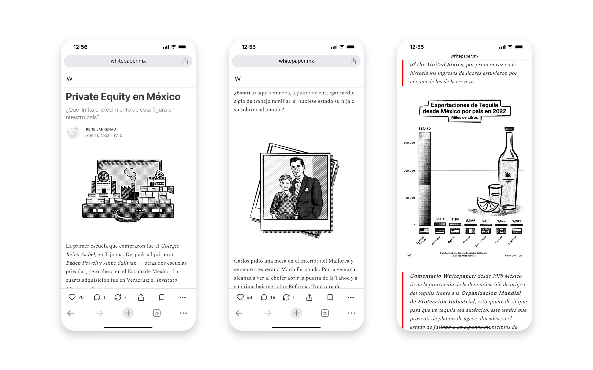
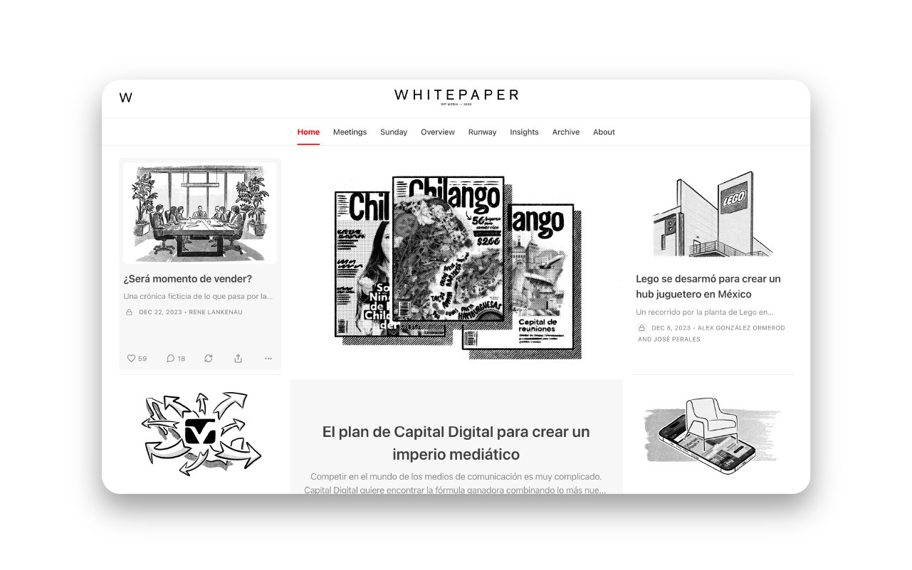
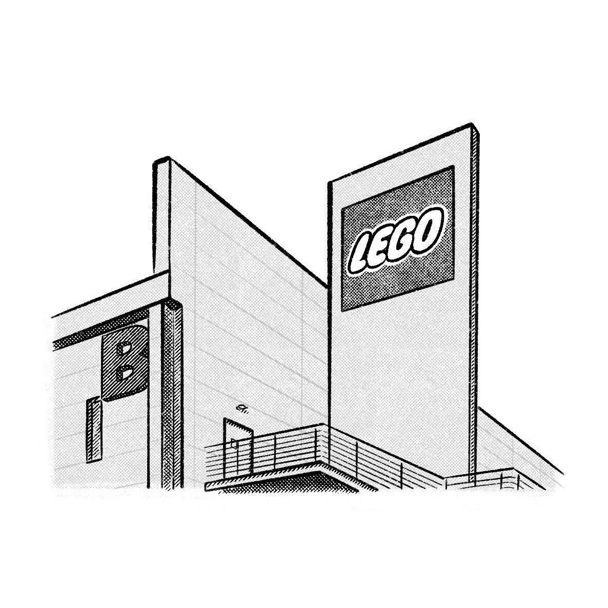
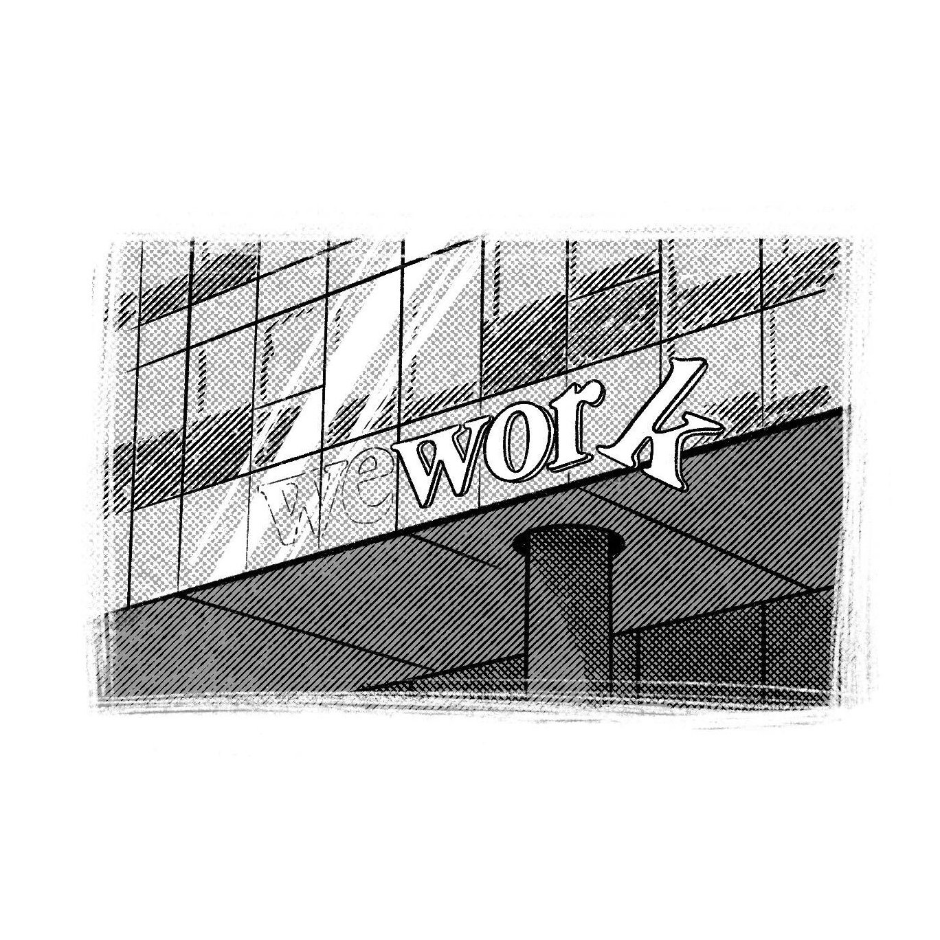
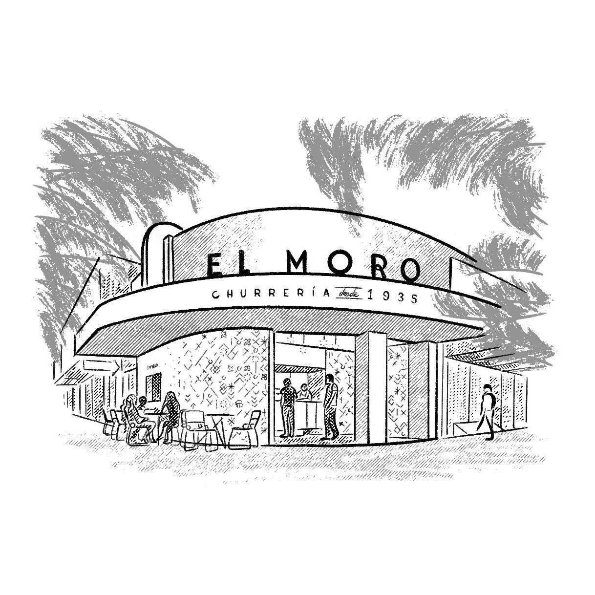

Whitepaper
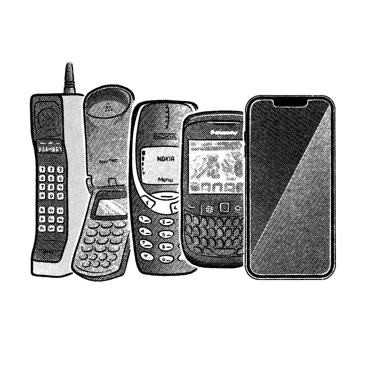
Whitepaper is a media company focused in the mexican business ecosystem. Since its launch in 2020, I’ve worked on building its brand and identity through its visual language, +1,000 editorial illustrations and infographics, the creation of a diverse portfolio of brands and products and their own individual brand families.
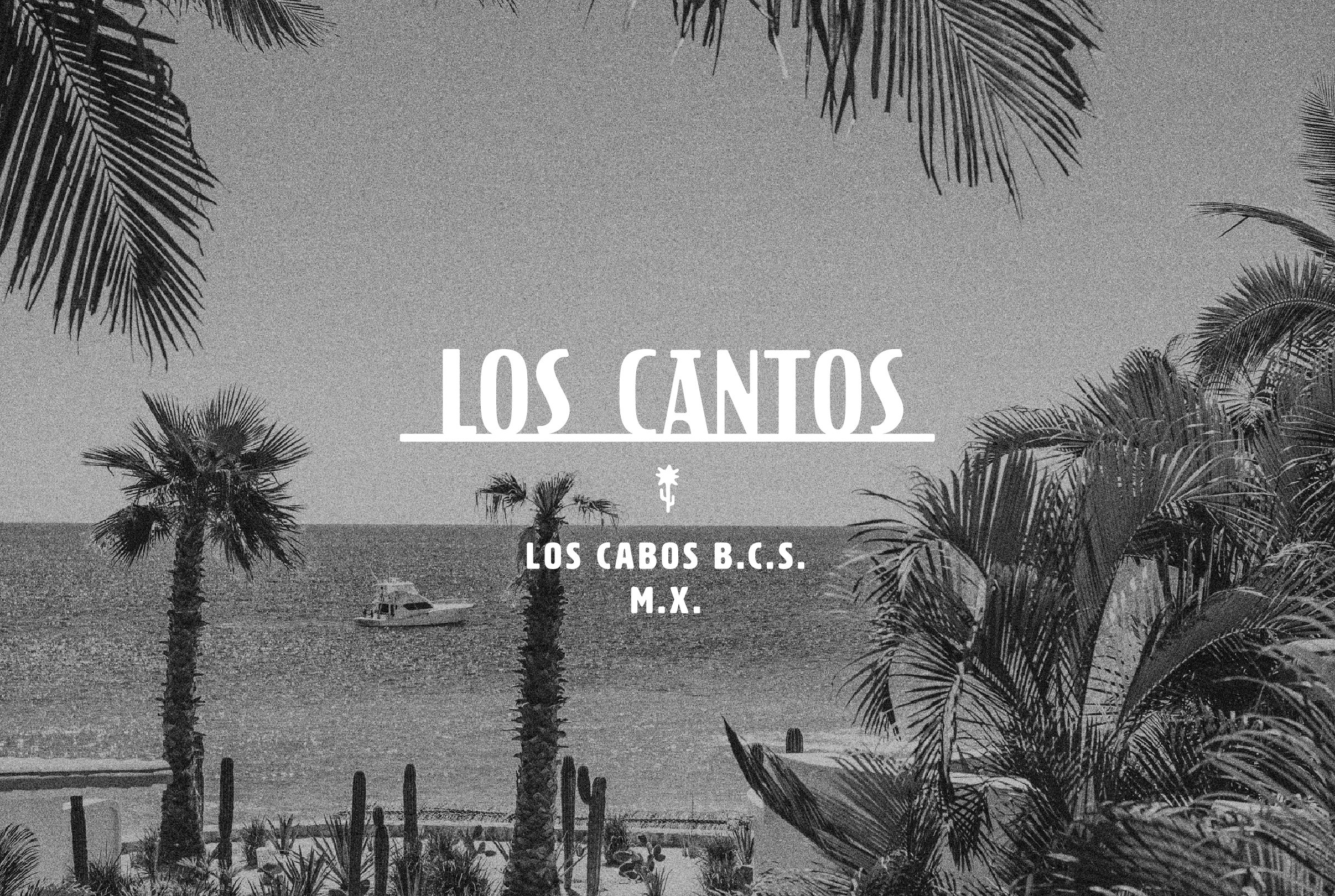
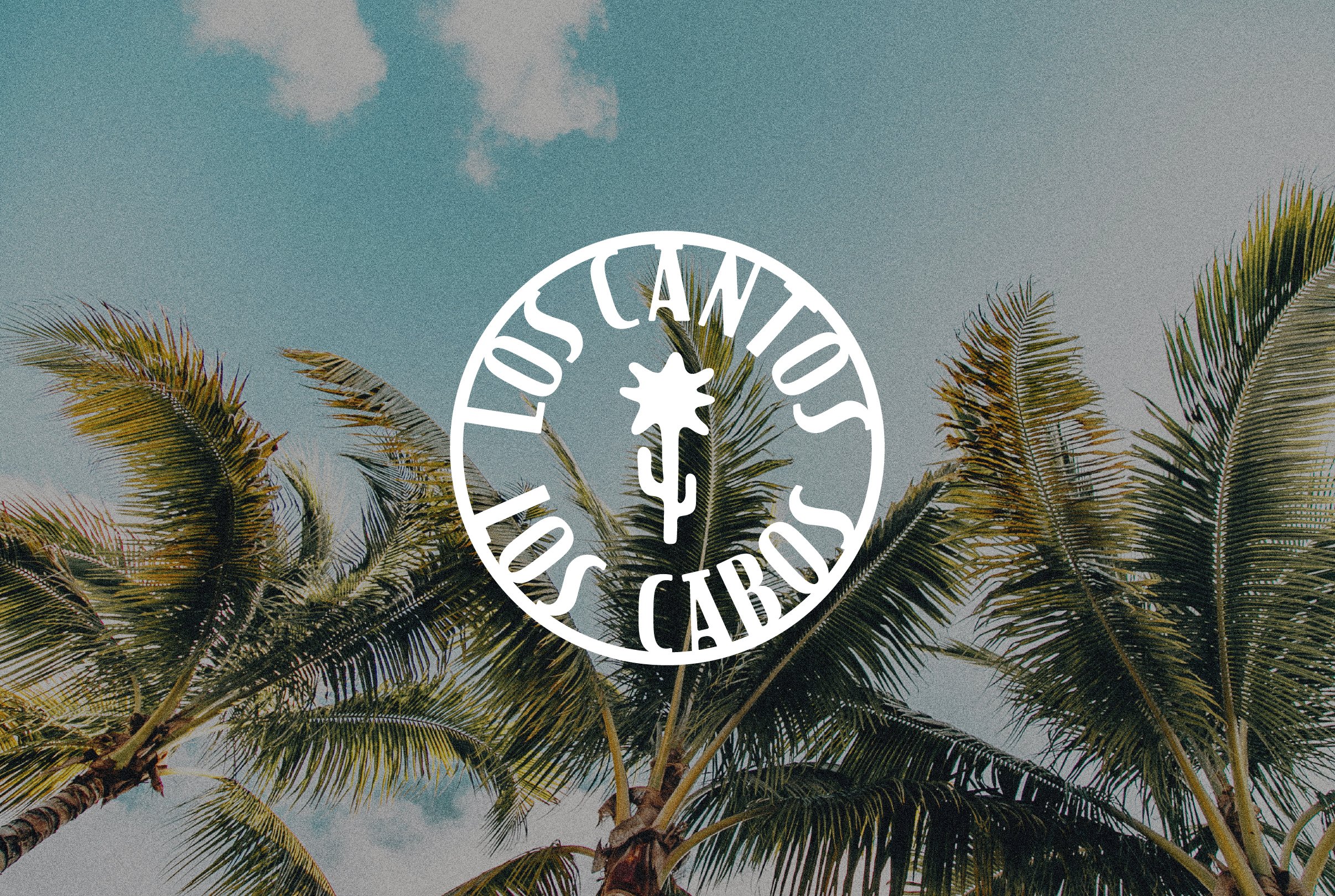
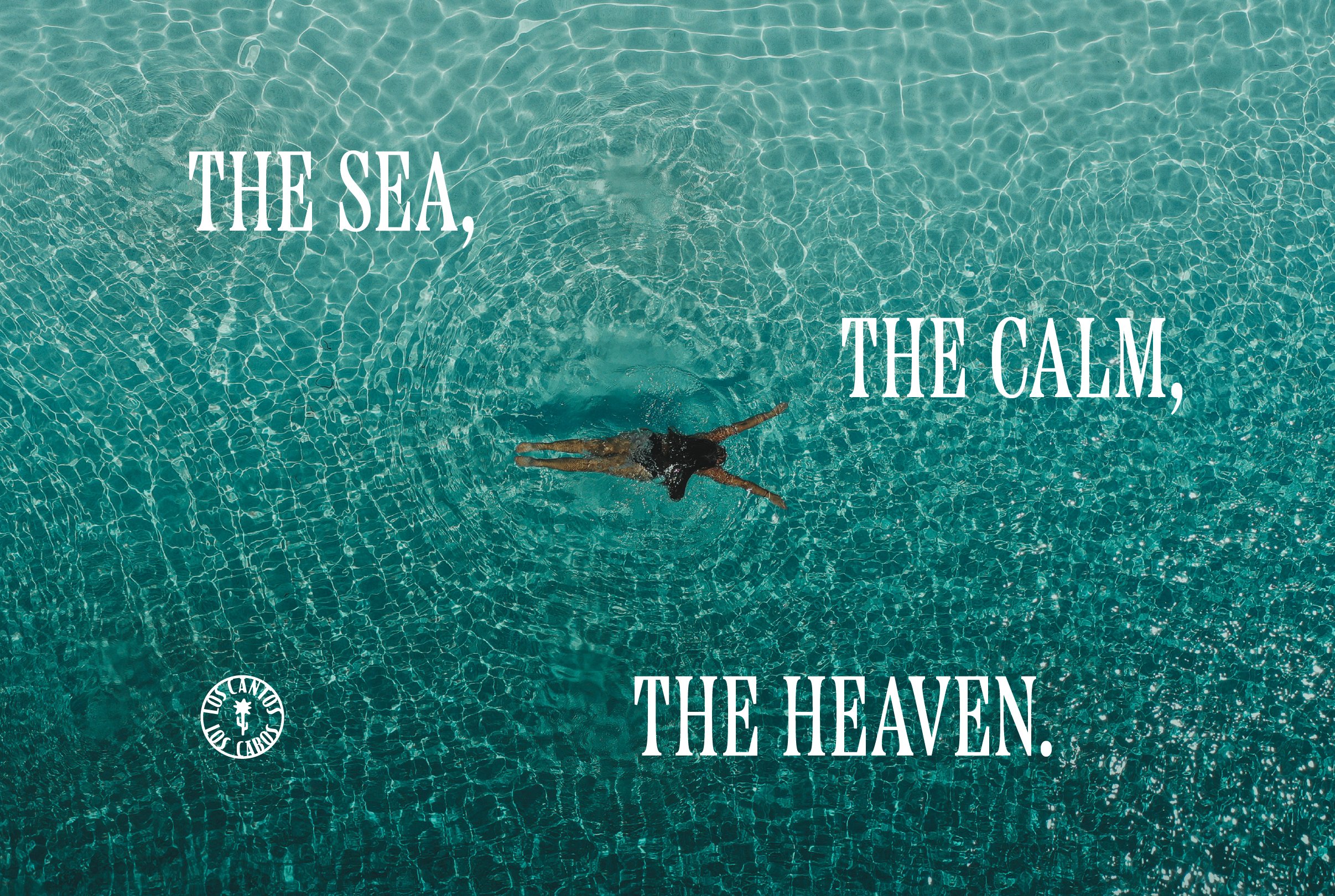
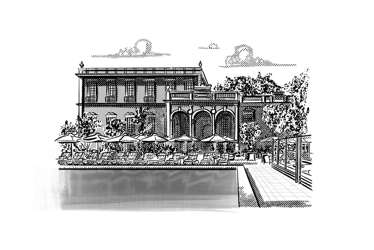
Los Cantos
A premium real estate development in the paradise of Cabo San Lucas. The residential complex, located near the beach


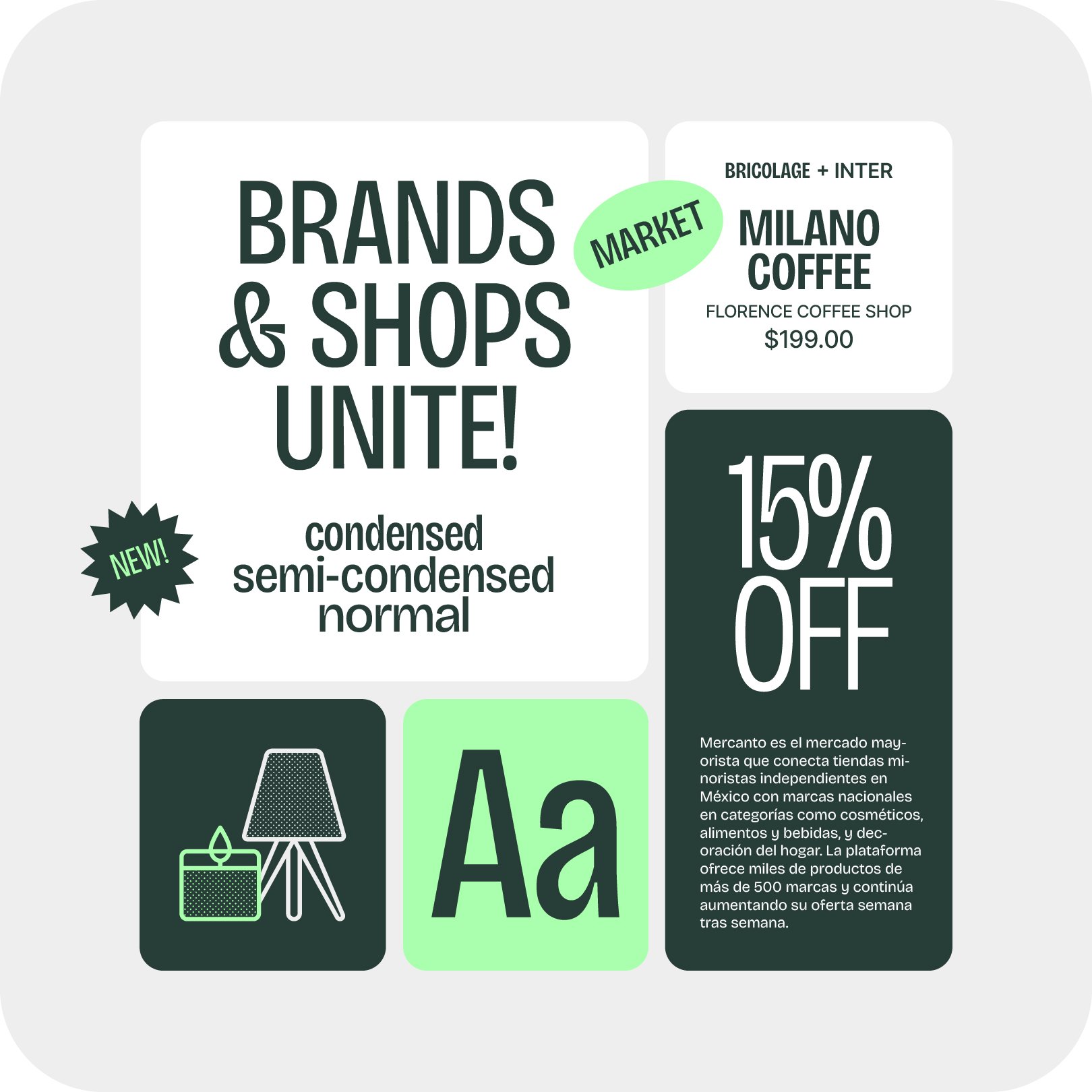
Mercanto
A B2B marketplace design to connect brands with stores and viceversa. We designed the whole branding system for this brand that lives mainly in a digital ecosystem.

A de Arquitectos
This architectural firm designs premium projects ranging from residential to large commercial developments. The visual identity was created with a very sober approach in order to let the projects take the main stage.
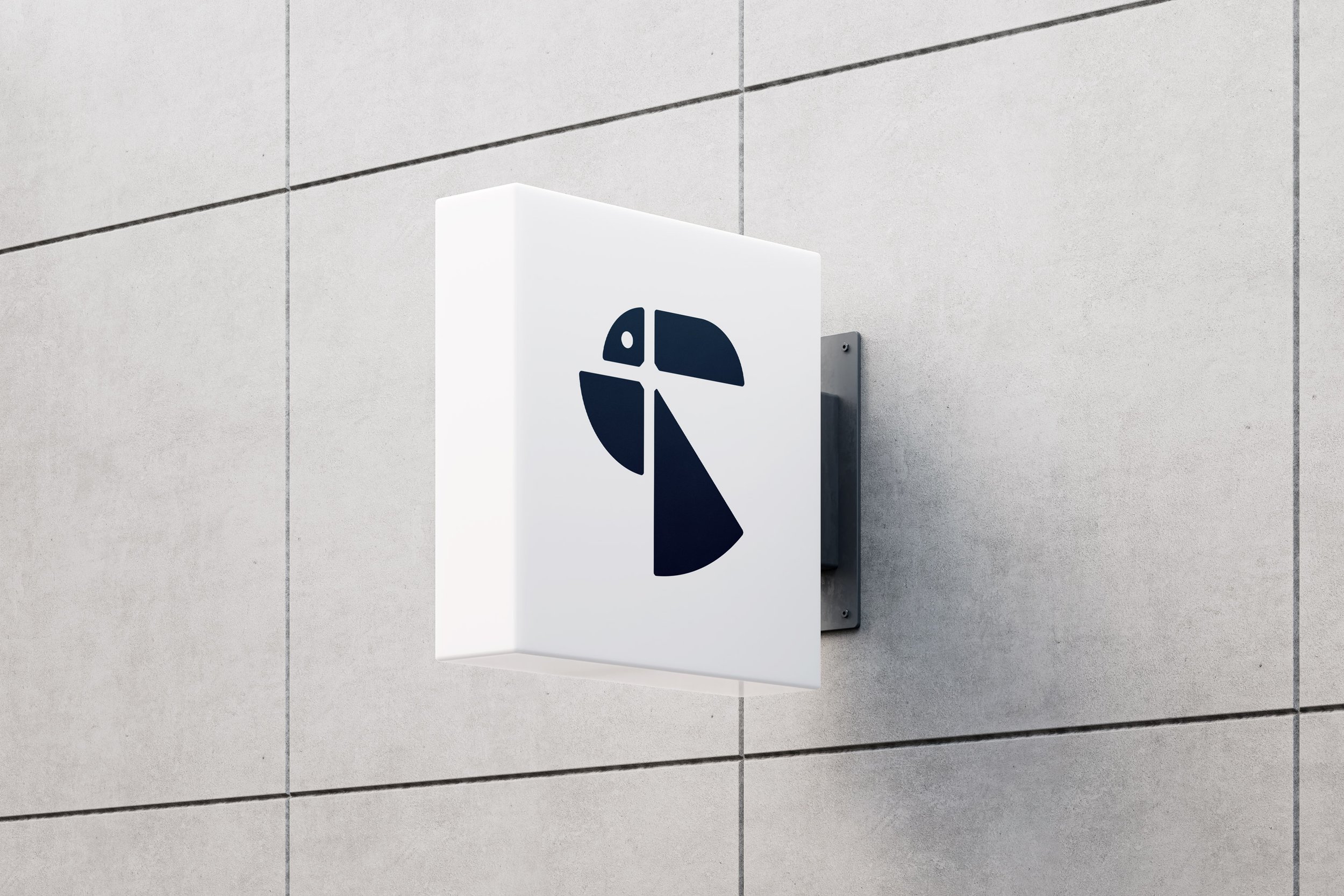

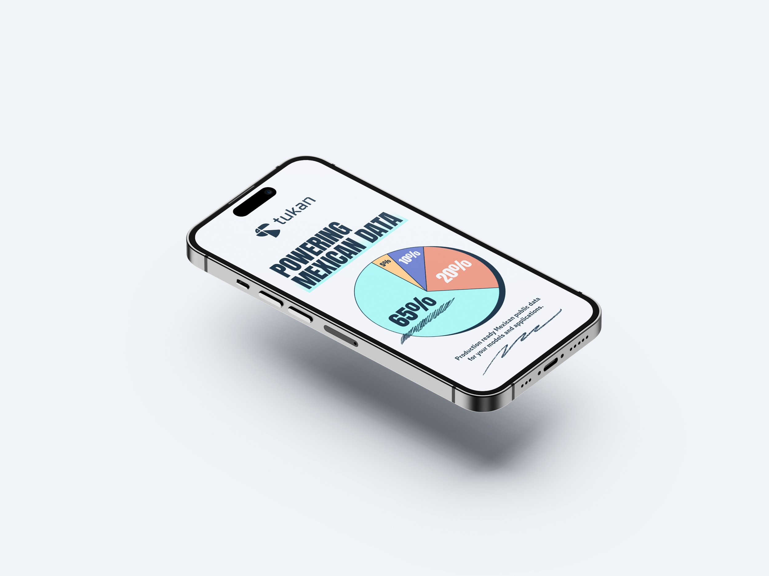

Tukan
Tukan is a One-stop-shop data platform that allows you to access hundreds of curated datasets via their API and web-platform. We created a visual language that communicates technology but takes the cold and stereotypical “digital” feeling out of the brand.
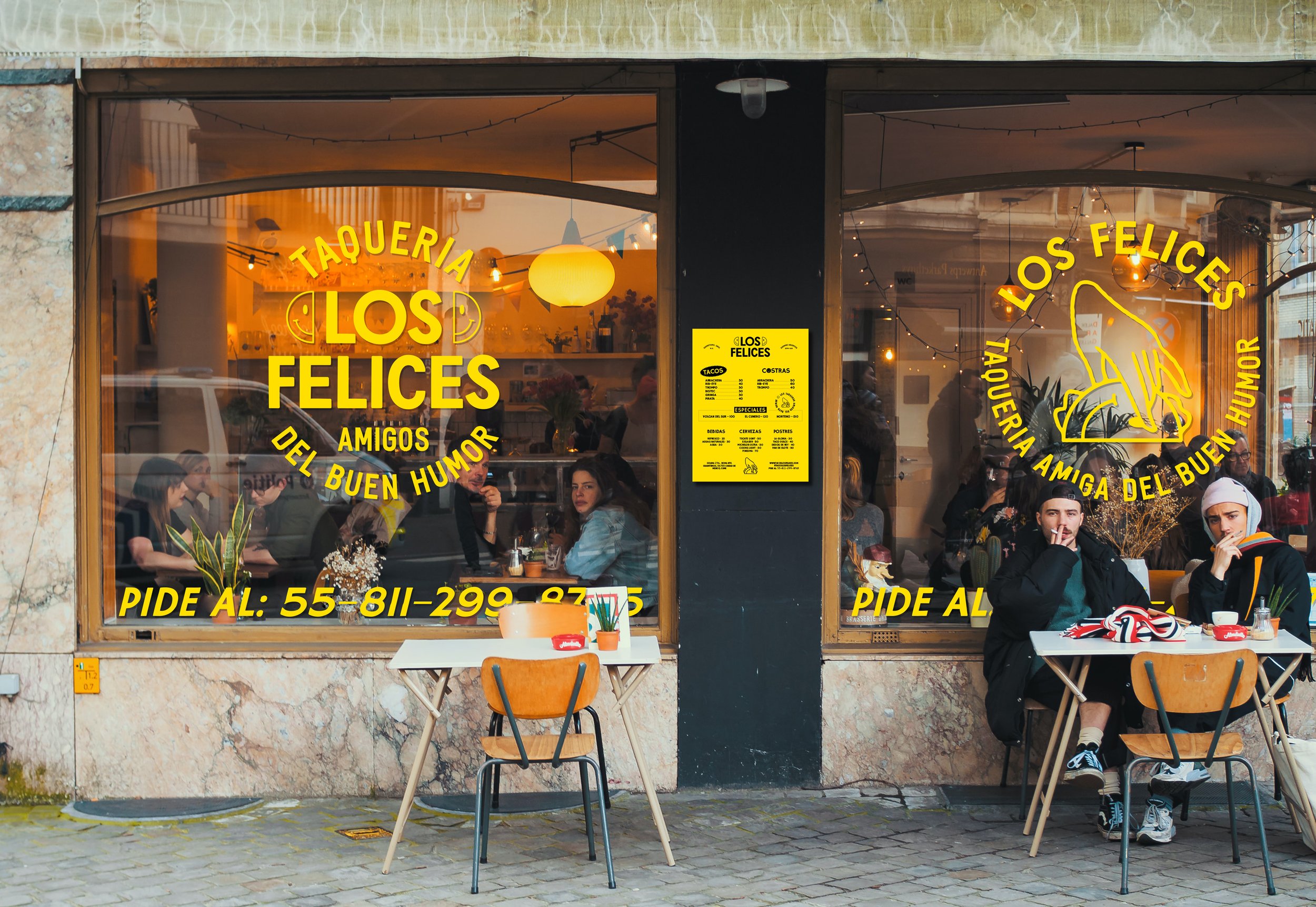
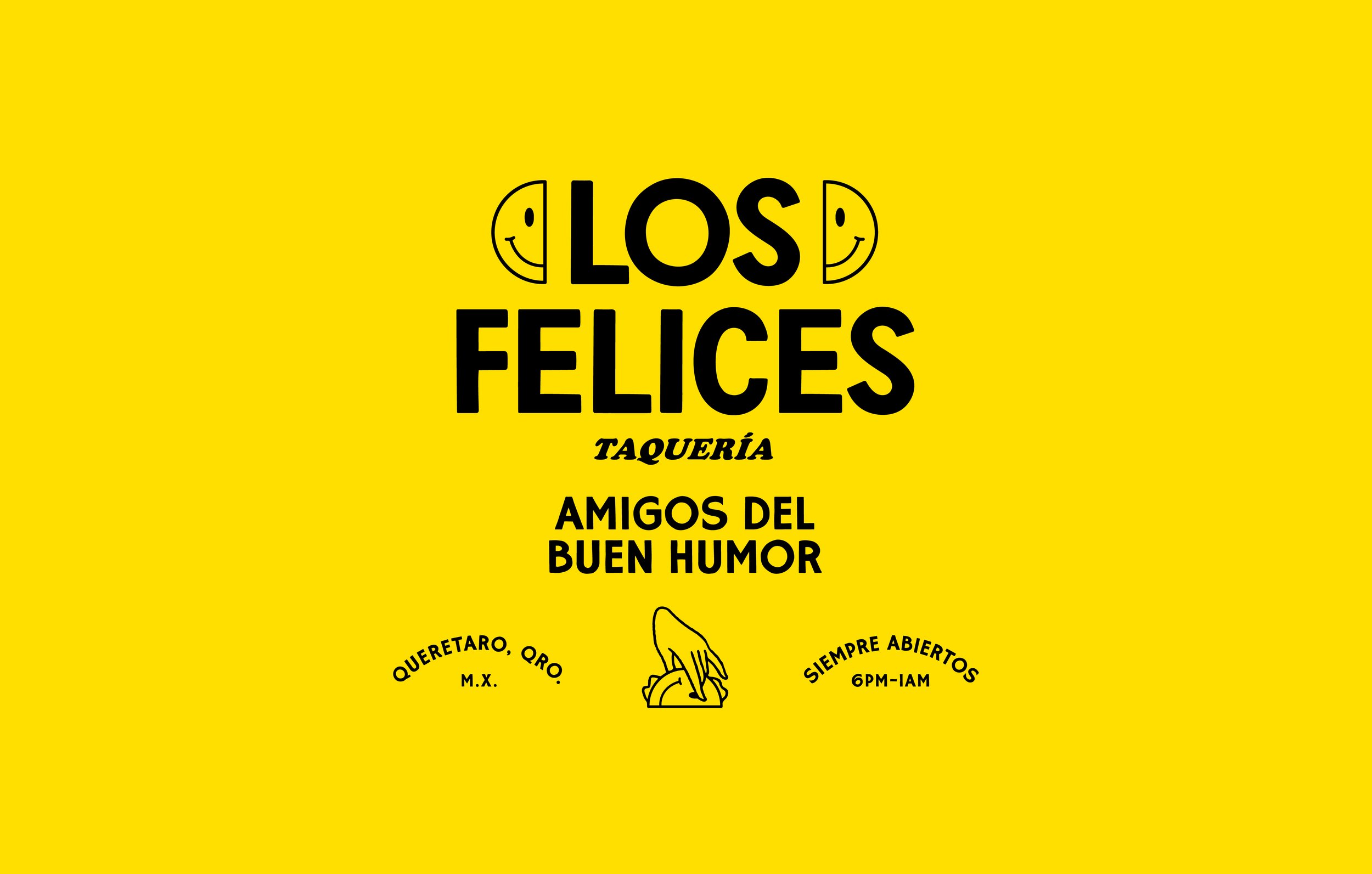
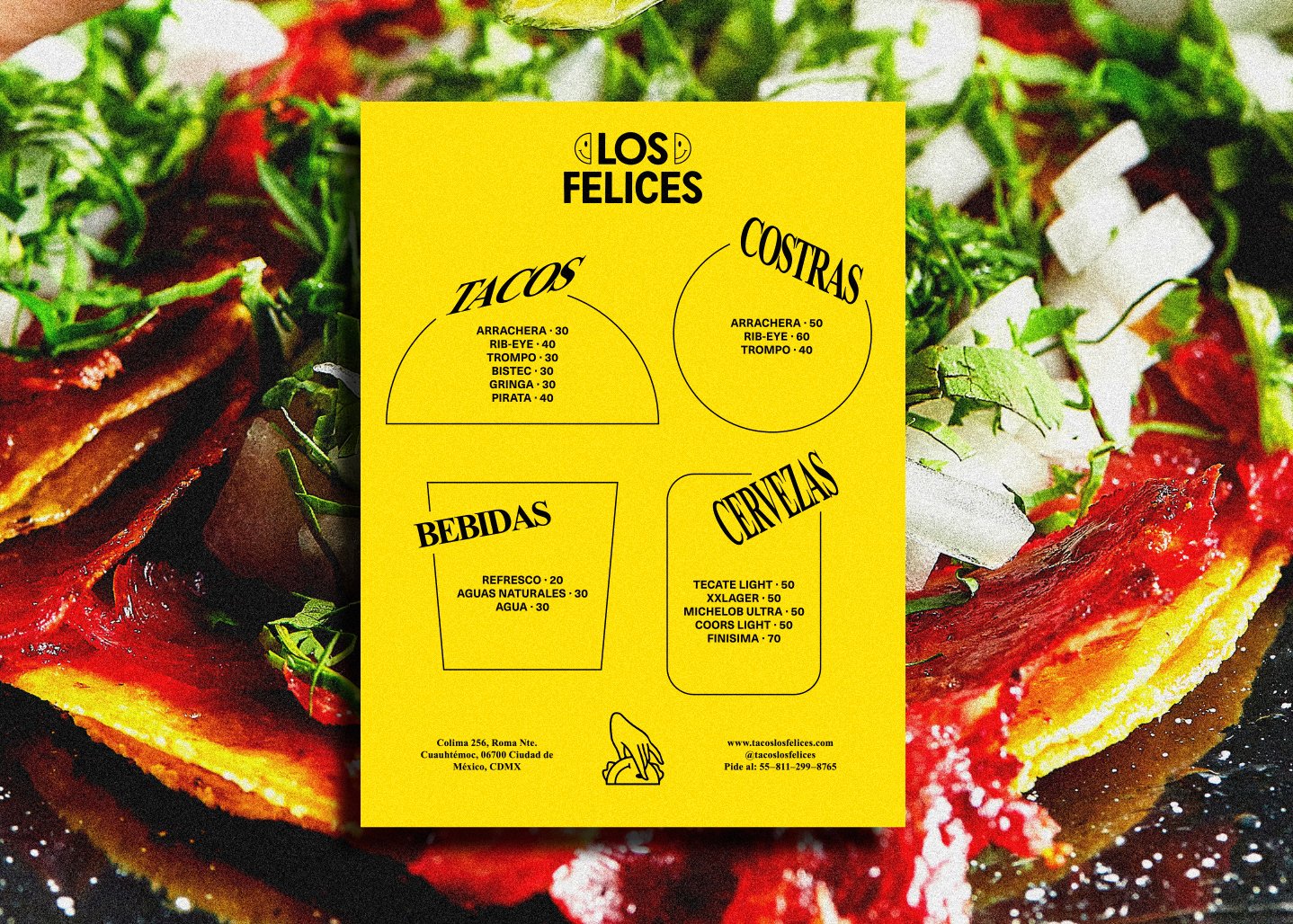

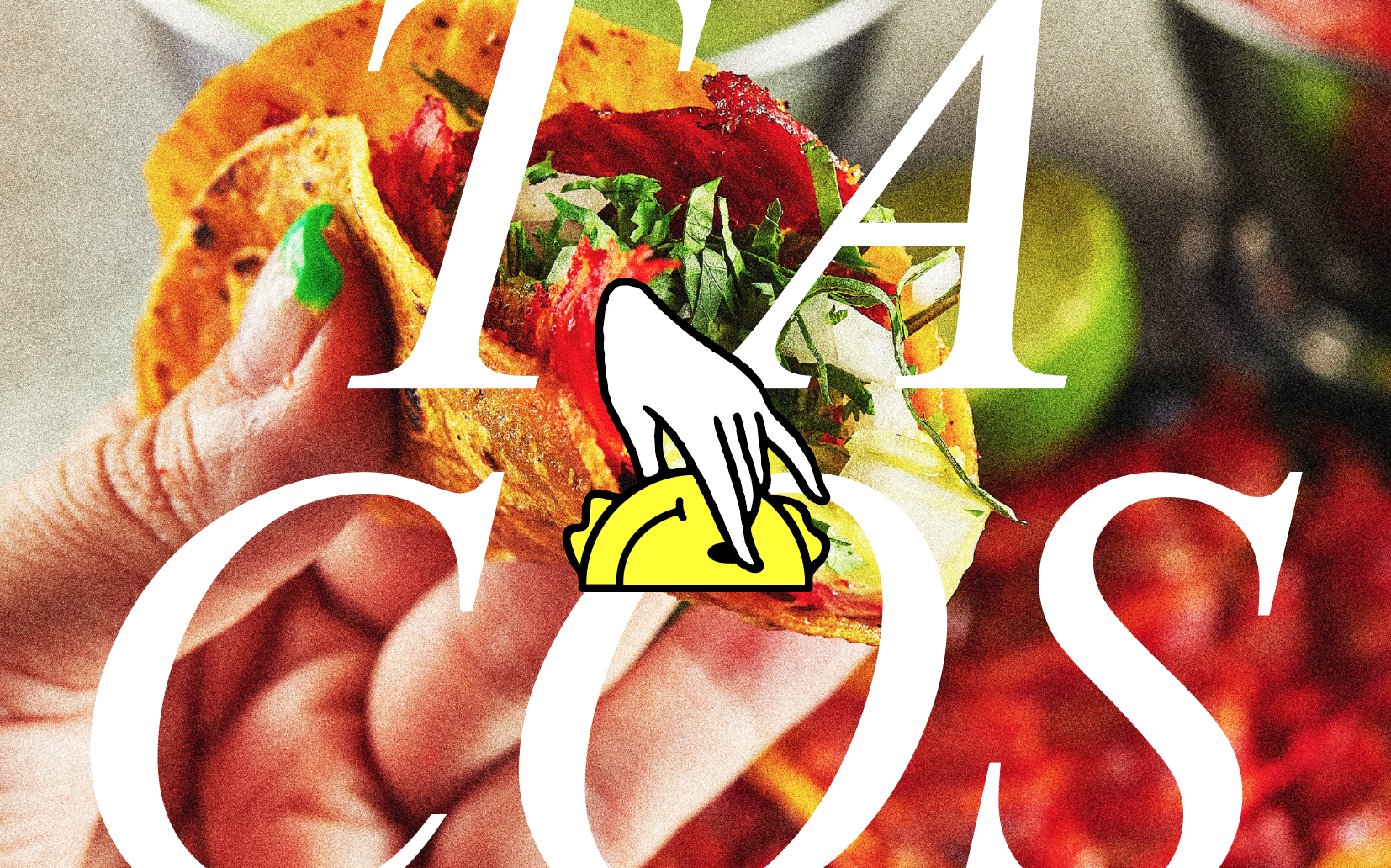
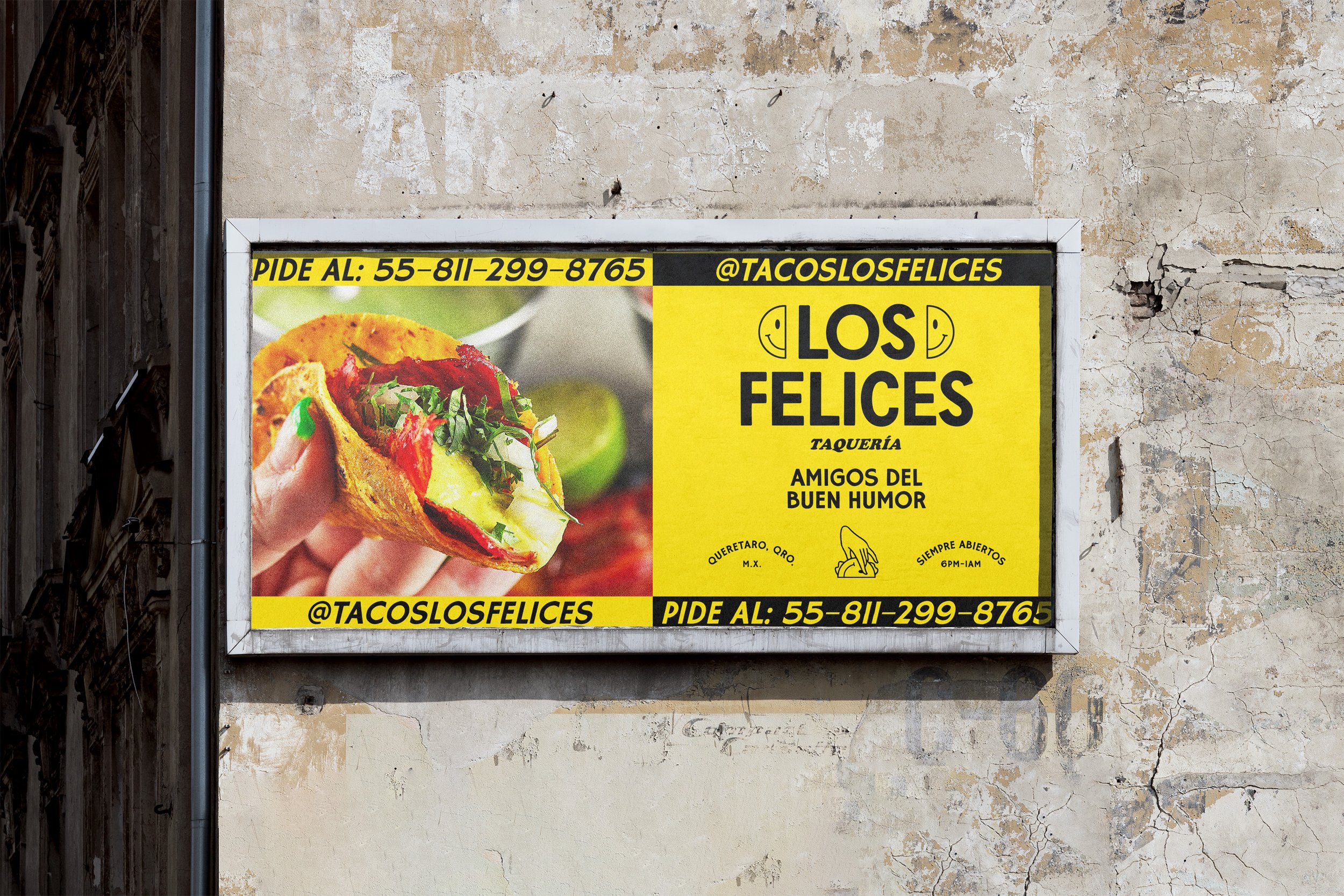
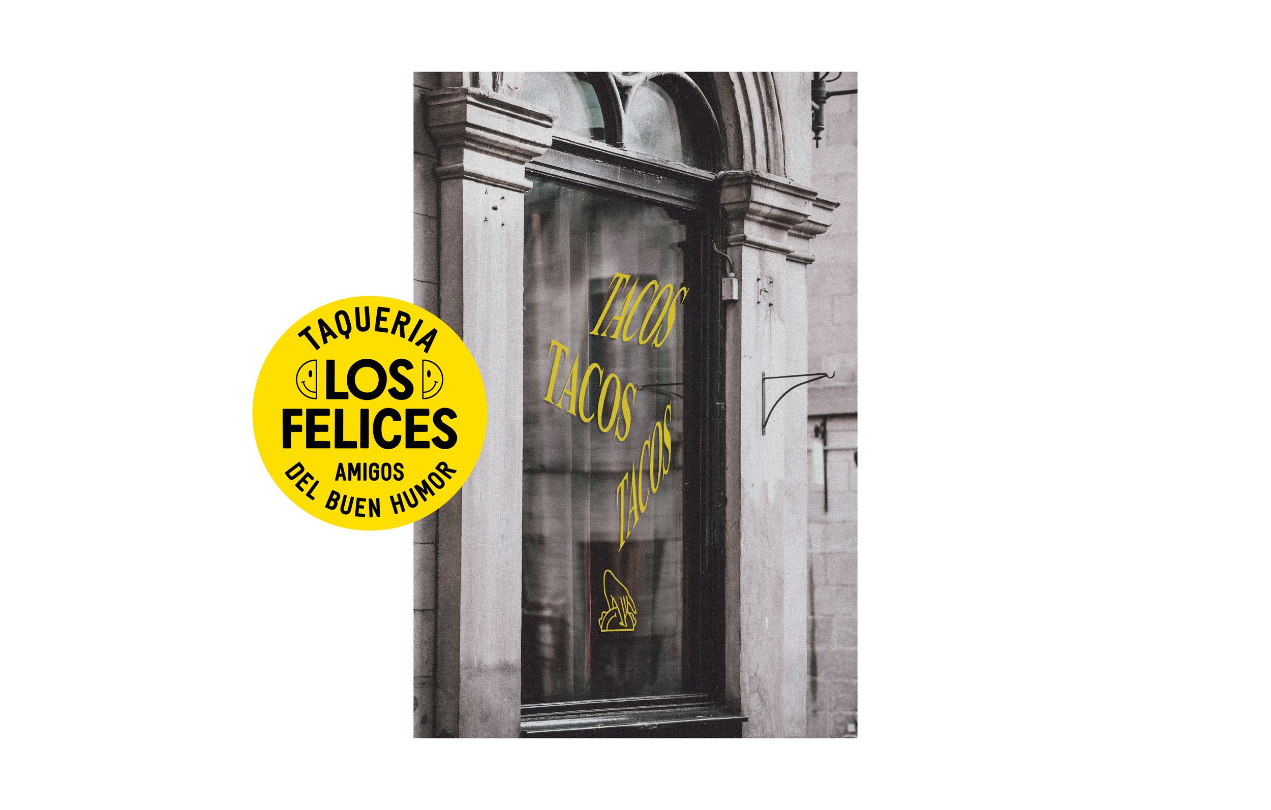
Taquería Los Felices
The brand for this taco shop located in Querétaro reflects the essence of their HAPPY customers.

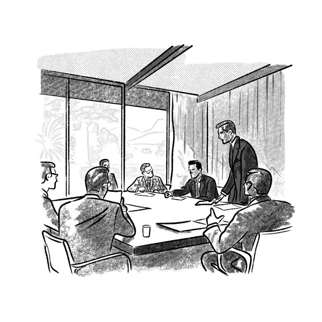
Wisdom Academy
This educational program is directed towards business veterans that are looking into new horizons in the next stage of their career. The logo represents a phoenix symbolizing a rebirth but also resembles the shape of an award’s cup as the prize of conquering a next step in life.

Clockers
For this fried chicken restaurant we thought of the simplest representation of a farm, the original home of the chicken.

Hubb
A digital community in which brands can connect with content creators in longstanding commercial collaborations.